|
My best artwork this semester, in my opinion, was my figure sculpture. I think my figure sculpture was the best because that's the artwork I put the most thought and emotion into it. The artwork idea that I would redo if I could would either be my Identity one or even my figure sculpture. If I could redo my Identity project I would change many things, such as, having multiple colored green lines, that would represent vines. Then I would add tiger lilies. If I redid my Figure Sculpture I would do a better paint job. I would make it look way nicer, and maybe come up with a different idea for the paint part. Something I have learned in art class this semester is not to give up. Especially when you mess up, everyone makes mistakes. It's just the people who want to change try to make up for their mistakes. I also learned that it's better to put emotion and feelings into artworks before you start, otherwise you may want to change something about it to late. Something I wish we could have done in art is more clay projects. I also wish we could have tried more different types of 3d art such as, resin, maybe something to do with the greek gods. I think it would be cool to try to make a greek sculpture.
0 Comments
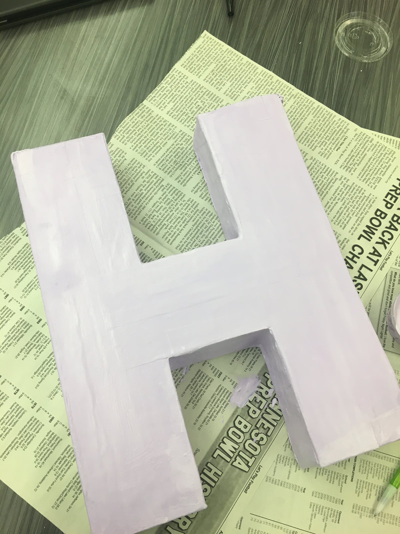
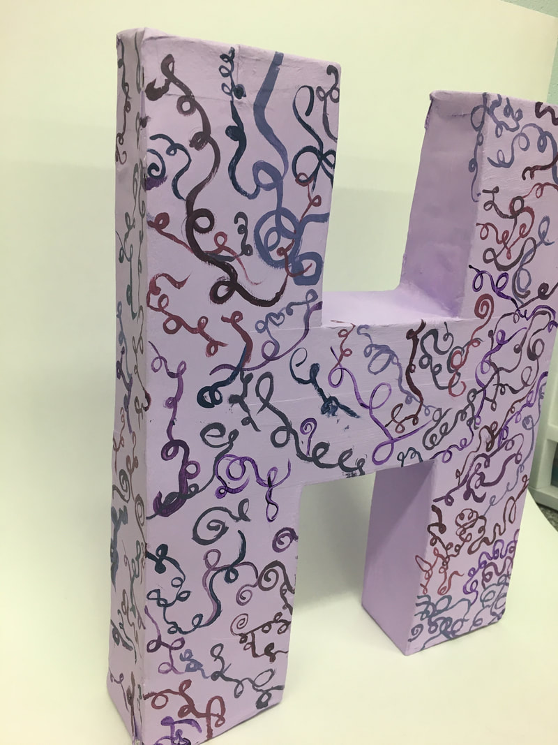
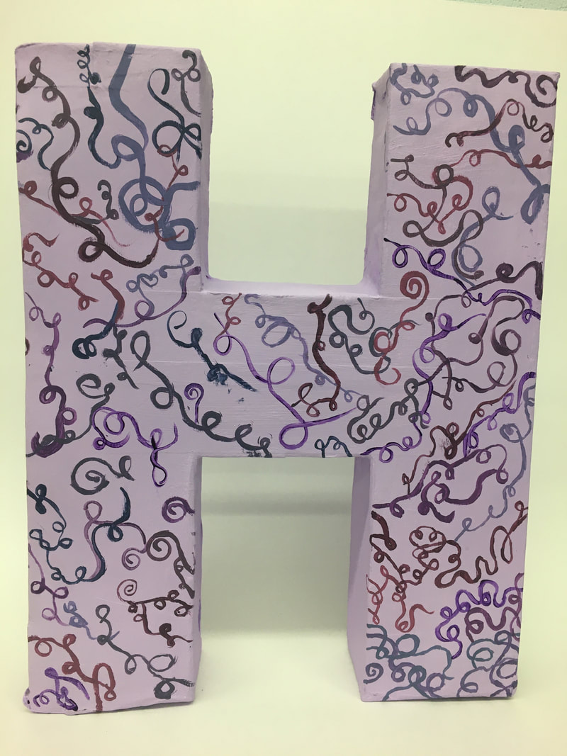
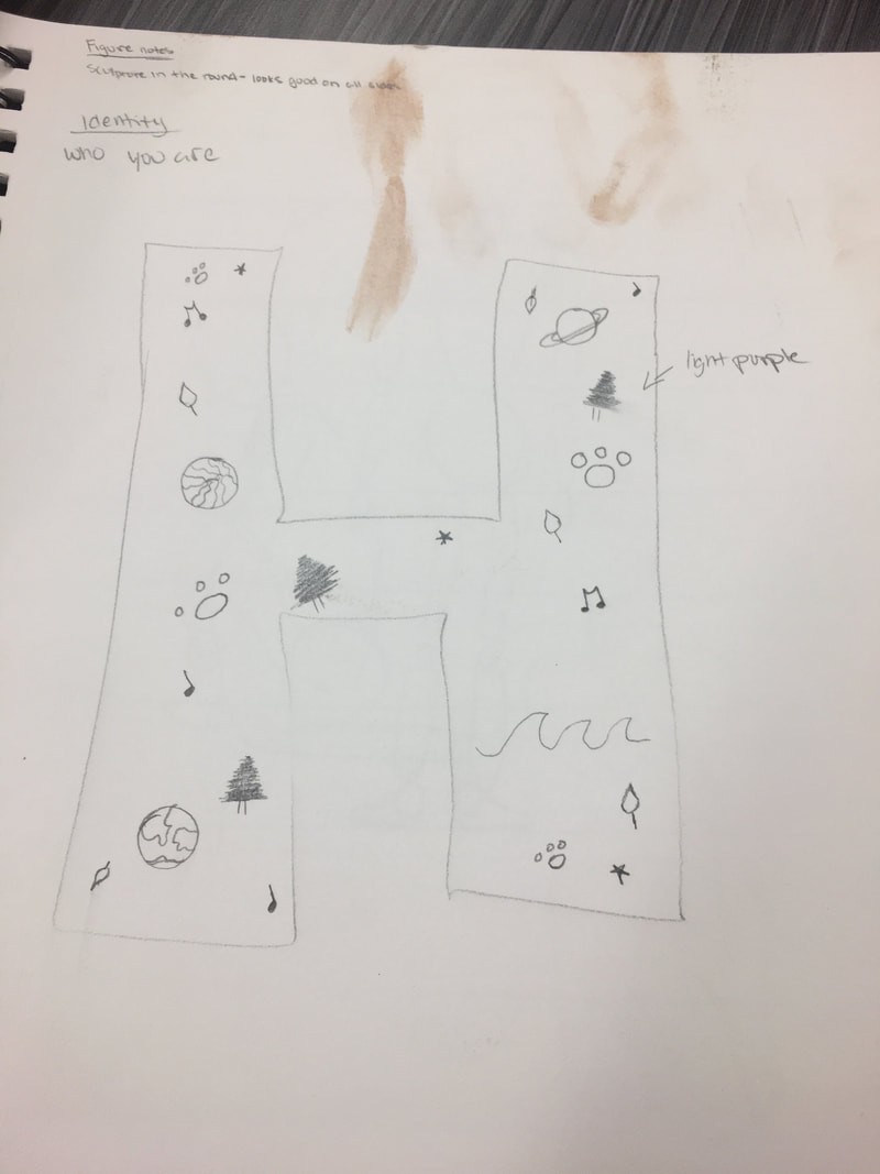
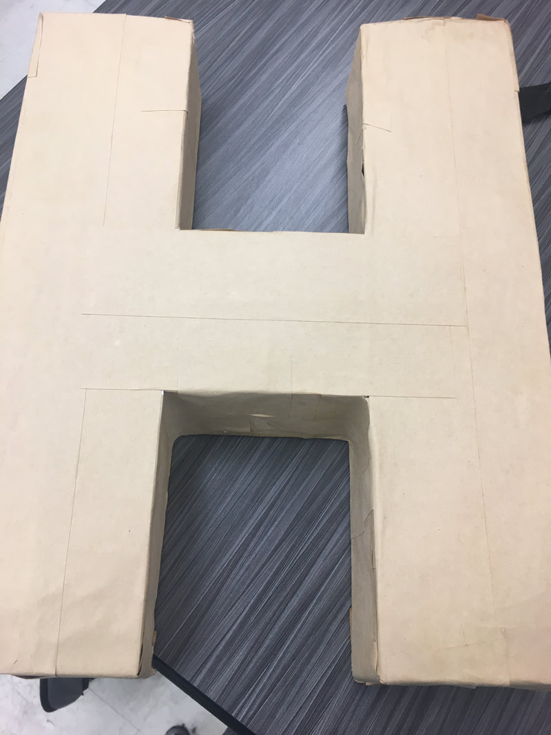
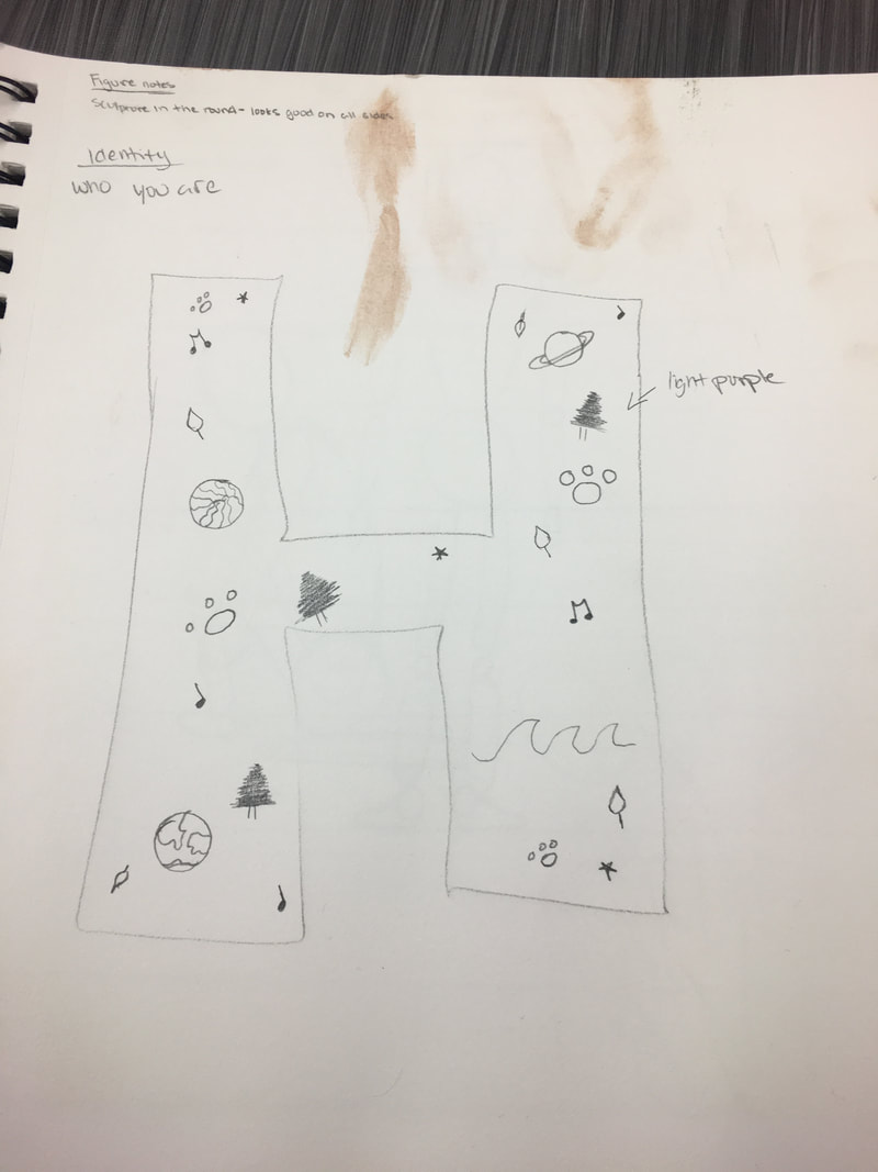
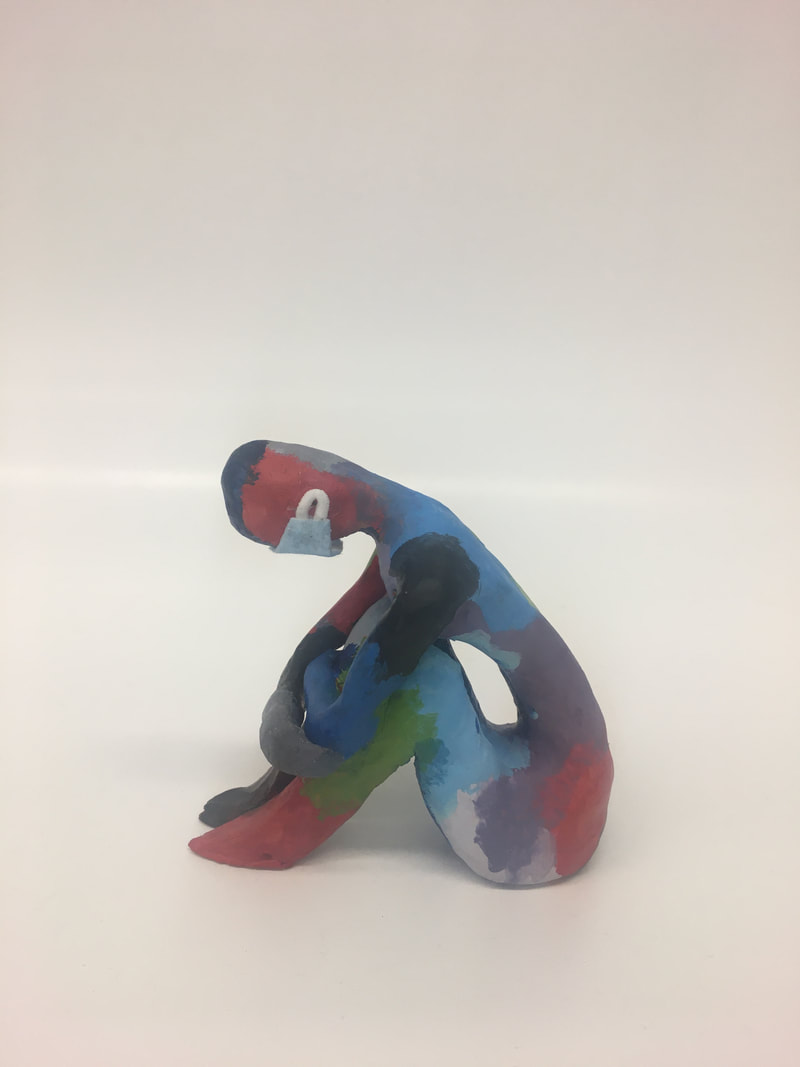
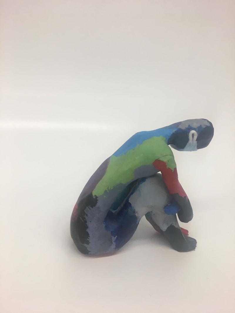
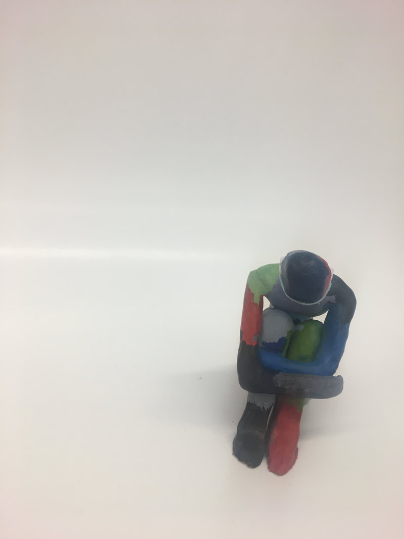
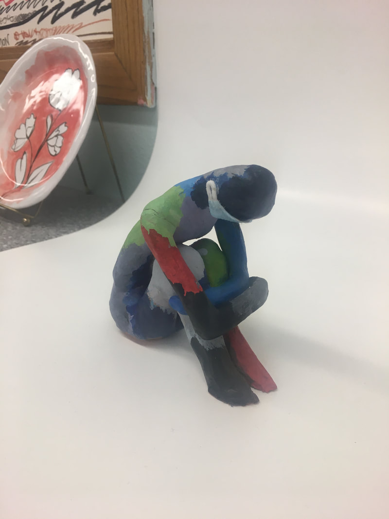
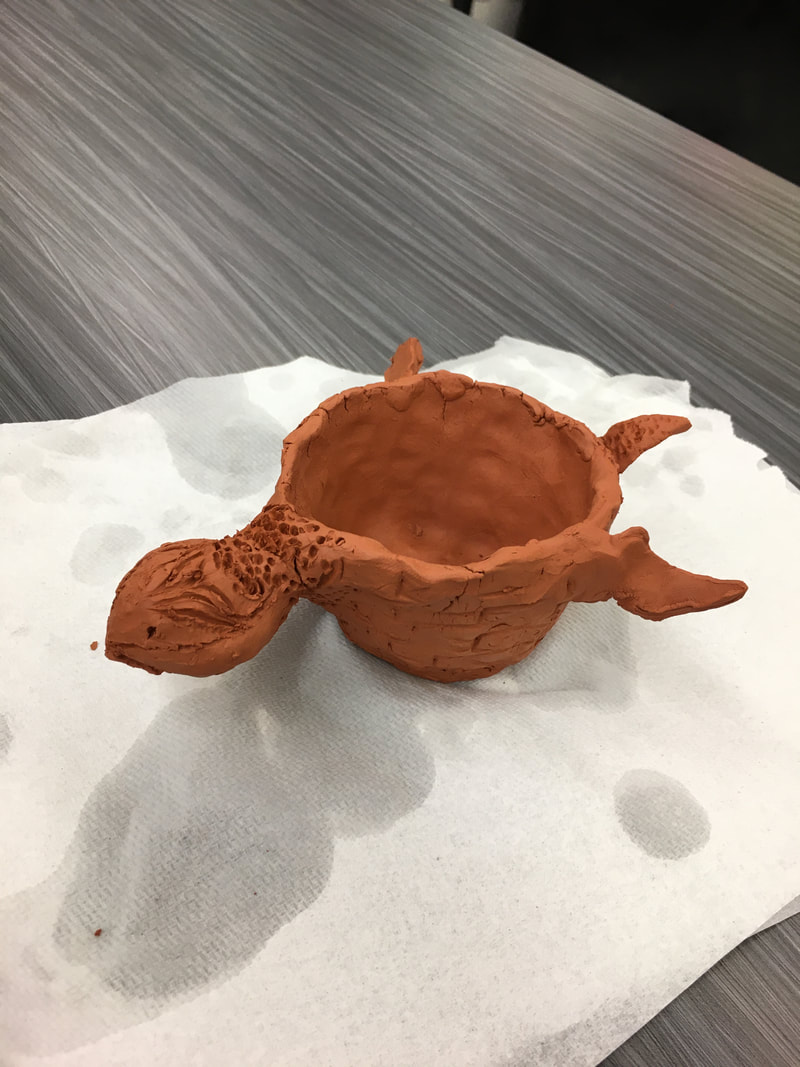
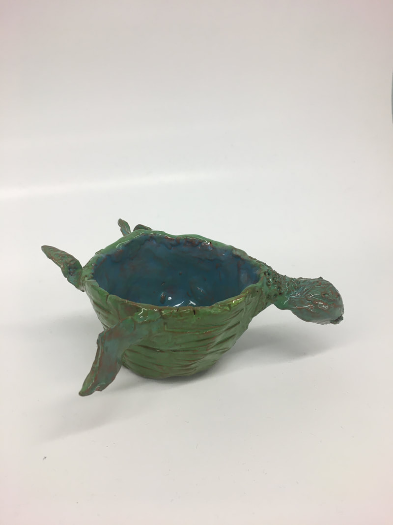
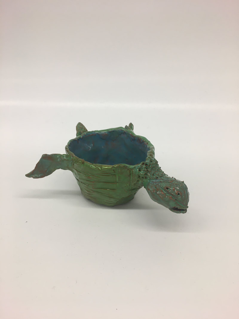
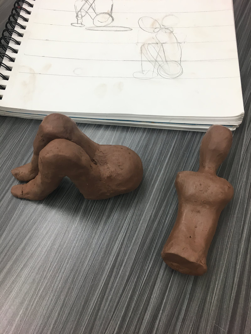
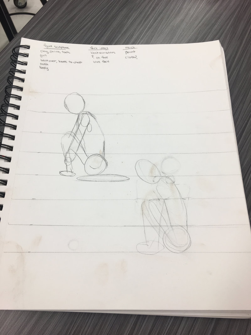
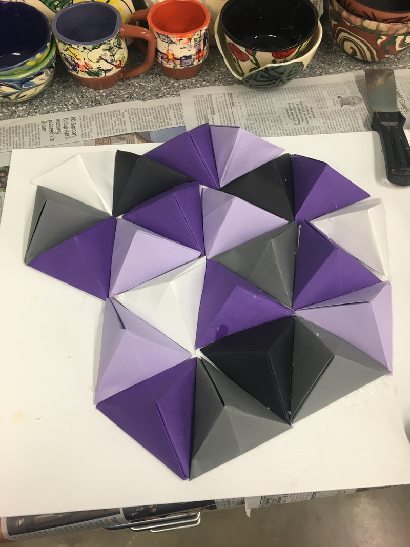
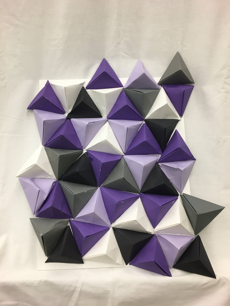
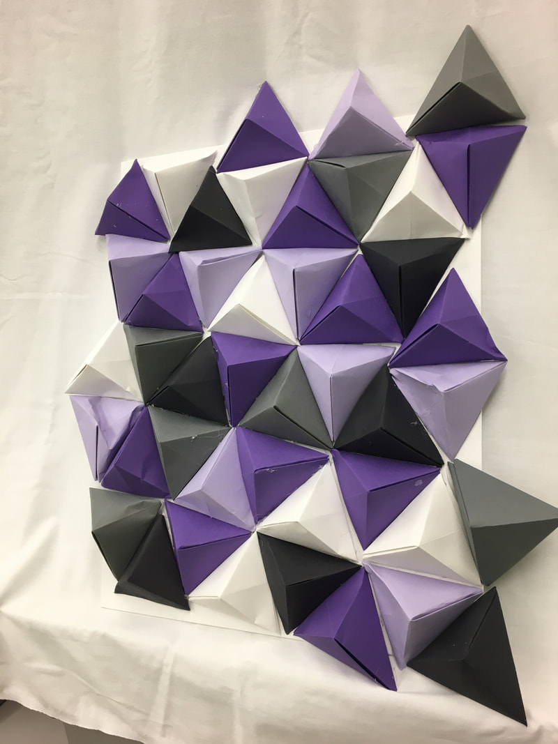
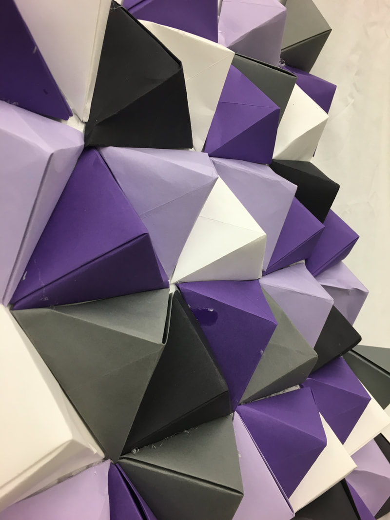
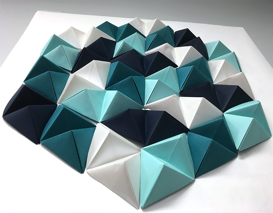
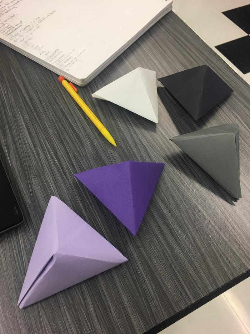
My artwork is a 3d "H" architectural letter. It is the color lilac because that is my favorite color. There are squiggly lines all over in different shades of purple. The lines represent uniqueness, messy, my favorite color, and fun. Lines that are squiggly look fun, and energetic. Some of the reasons the lines were included were because I am fun, energetic (most days), my favorite color is purple, I am unique, and I can be messy. I created my artwork by drawing an "H" on a piece of paper. Then I cut it out and traced it onto my task board. I had two separate "H" flawboard. After the flawboard was cut out I took glue and small paper cups, I glued the paper cups between the two "H" pieces. After I let that dry I used paper tape the make the edges flat and even. The "H" architectural letter is supposed to be able to stand up. Mine on the other hand had to be fixed three times. After my "H" could finally stand, I did two coats of gesso. Once the gesso had dried I painted it lilac, then added the lines. My big idea behind my artwork was to express myself in a creative way that was also fun to do. So I chose lines. Different types of lines can show different emotions. Straight lines can show things like annoyed, neutral, or even bored. I used squiggly lines because they look unique. They also give off multiple emotions, such as, messy, happy, unorganized, exciting, and hyper. My goals for this artwork were to actually have the "H" stand up straight, another goal was to have the multiple shades of purple go with each other. My overall thoughts of my final artwork, "Identity", are that I am happy the "H" stands up. I think I could have done a better job with the lines, or came up with a better idea. I had multiple, my first being just adding small paintings of what I like, such as trees (nature), paw prints (dogs), and stars (for my obsession with space). My second Idea was the idea shown in the pictures below, aka my final. I had a third idea, that came to me two days ago, and that was to have the background color stay the same. Then have different shades of GREEN lines (to represent vines). Then to have tiger lilies coming off the vines. I came up with this idea because, once again my favorite color is purple, I think purple shows elegance, bravery, and independency. My idea for the tiger lilies came from those being my favorite flower. My Nana once made me a flower box, and the first flower she planted in it was tiger lilies. I think tiger lilies are very pretty. Obviously two days ago was a couple days late, but I hope to be able to make an artwork with tiger lilies someday. I think next time I will give and put more thought into my artwork. Even though the idea I did wasn't my best idea I am still proud that I didn't give up on the lines. This is no where near my best work, but considering the time I had I think I did a good job. So far during the process of making my Architecture letter I have used develope craft, because I have never done this before. I have also used engage and persist. First I traced a H on flawboard and glued small cups to it. After that I glued the second flawboard H on top of the small paper cups. I let it dry then started putting paper tape around the edges. After I finished with the paper tape I realized the bottom of the H is not flat, so I had to flatten it out so it can stand. Then I recoated the area with paper tape and now its uneven again, this is how I have used engage and persist. After I flatten it out... again.... I will do one coat of gesso. For the details I will be painting the H a light purple, lilac like. Then I will be adding small paintings showing things I like. The two studio Habits of mind I will be using are Understand Art Worlds, Stretch and Explores, as well as Develop craft. My idea for this artwork is to do the letter one. I will add small details to it of things that I like. I will add planets, paw prints, trees, and music notes. My letter "H" will be a light purple/lilac. I plan on sharing my interests in this artwork. I also plan on using acrylic paint to mix the right purple. My artwork is a girl with her knees pulled to her chest, her arms are wrapped around her legs while she is wearing a mask. The girl is painted with multiple different colors, such as red, blue, black grey. The colors represent different feelings I felt over quarantine. Red being angry, blue being sad, grey being bored, black being numb. I created my artwork by using proportions to figure out the size of the body. I would then make all my seperate pieces, then attach them. Once the clay dried it was put in the kilm. After it was taken out of the kilm I painted it, The big idea behind my artwork was for people to know what my artwork was saying without having to say anything. My top two goals for my artwork were for if anything is to break to fix it. My second goal was to get the girl as proportional as possible, Two studio habits of mind I used was Engage and Persist. I also used stretch and explore. I used stretch and explore by trying out pinch pots. I used Engage and Persist by embracing the fact that my wings kept falling off so decided to make the wings small and dorky. My plan from the beginning was to make a cute dragon, after I started working on it I changed my idea to a dorky dragon. I first pinched my pot, then I worked on the head shape. Then the wings and tail. After all the pieces were ready I added them on to the body. After the clay was dry it got fired and I added glaze to it. The glazes I used were Sour Apple, Green Thumb, and Blue yonder. My plan is to make a girl who is holding her knees to her chest with a mask on. The pose of the girl is too show how lonely quarantine was for me and how it affected me. The mask is to show its about covid. I'm making the actually sculpture part out of clay and the mask will most likely be made out of fabric. Two studio habits of mind I'm using is engage and persist by solving problems with clay and develop craft by learning how to use proportions with clay. My artwork description is mainly just light purple, dark purple, grey, black and white origami triangles. They are glued down to a posterboard, with no specific shape. I created my art by making many origami triangles and then gluing them down. The big idea behind my artwork was to make something that could hang in my room. I also wanted it to be somewhat geometric. My goal was for my artwork to turn out how I wanted to and I think I accomplished my goal. My overall thoughts are that I could have made the paper folds more crisp, but it still turned out very well. My plan is to have a bunch of hand made origami triangles. Then after they are all made I will glue them to a poster board in a shape. I have not decided which shape because I have not finished my triangles. I am using envision by planning everything out and thinking about shapes to put my triangles in. My other studio habits of mind that I'm using is stretch and explore because I prefer my artworks to be of something, but I'm exploring non-representational. I am using Repetitive as my principle.
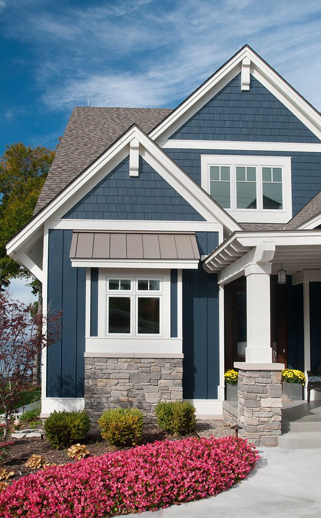
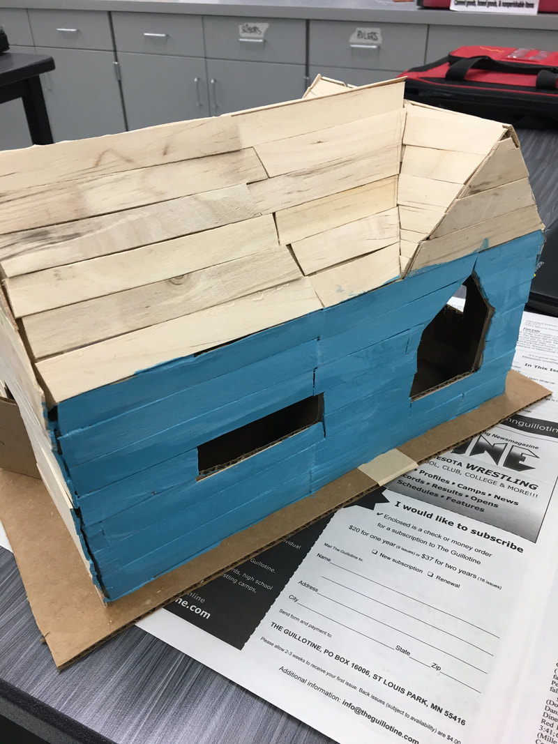
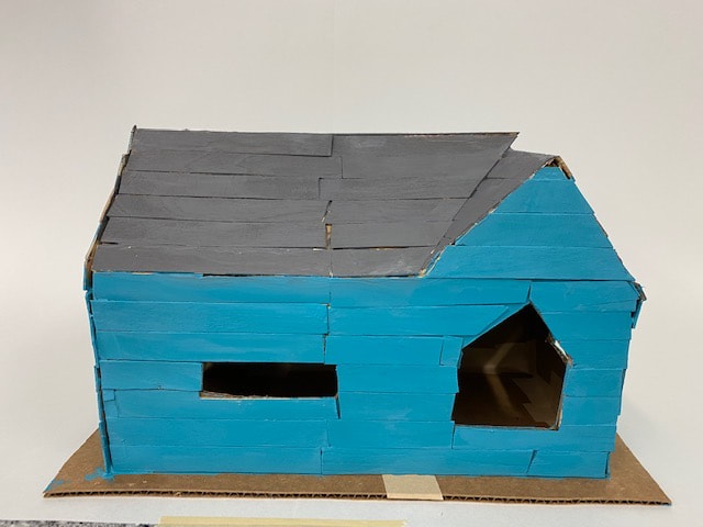
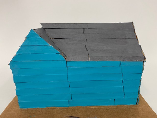
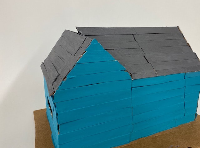
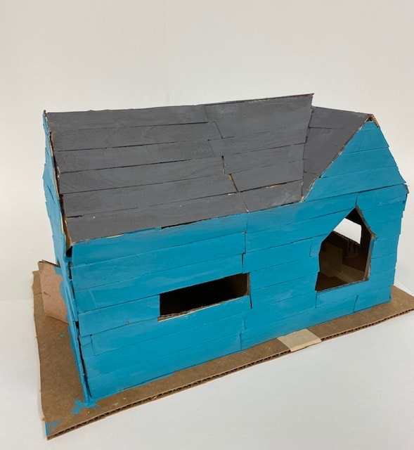
My artwork is a blue house with a medium brown/grey roof. It has 2 windows. One window is on the front, in the shape of a pentagon. The exterior of the house is popsicle sticks. I created my artwork by using cardboard, exacto knife, paper tape, tacky glue, popsicle sticks, and acrylic paint. First I used the cardboard, exacto knife, and paper tape to get the foundation. I measured the correct lengths for the sides, roof, and base. I used paper tape to stick it all together. After the main foundation was done I used popsicle sticks and glued them to the cardboard. Once the popsicle sticks were all glued on I used acrylic paint to match the color of my inspiration picture. The big idea behind my artwork was to make a modern day house. I used inspiration from Charles R. Stinson for modern ideas. I used a picture off google for the main foundation of my house (shown in the last architecture post). I also used another photo off google for the exterior color of the house. My goals for this artwork was to try my best and not give up when things got hard. My overall thoughts on my artwork are that it looks good. I wish I would've stuck with a grey/brown for the house color, but I'm happy I went out of my comfort zone with the blue. I also think I could've done better with the popsicle sticks if I had more time. Overall I think I tried my best and it turned out really good. |
 RSS Feed
